Interface Redesign
One task at university was to redesign the interface of a game that I've created (with Adrian "Ace" Köhlmoos) in one of the semesters from before.
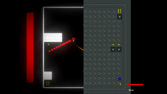
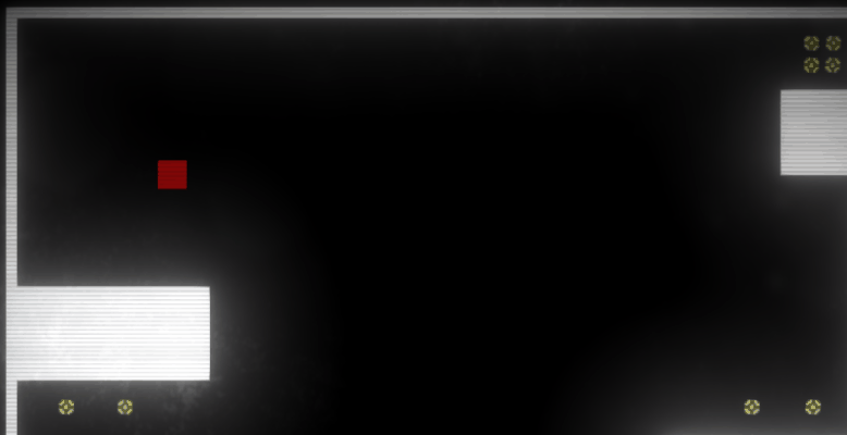
The game is a 2D Top-Down Arena Shooter. It's not the most innovative thing, but that wasn't our point at the time. We just wanted it to feel good and be fun. Here's a screenshot of how the game
looked before.
The red and blue player sprites were actually only placeholders. But I've thought why shouldn't we take that as a new theme. Then I came to the conclusion that combining this Red/Blue-Theme with an arcade-machine kind of look could look nice.
Here are the steps I've taken:
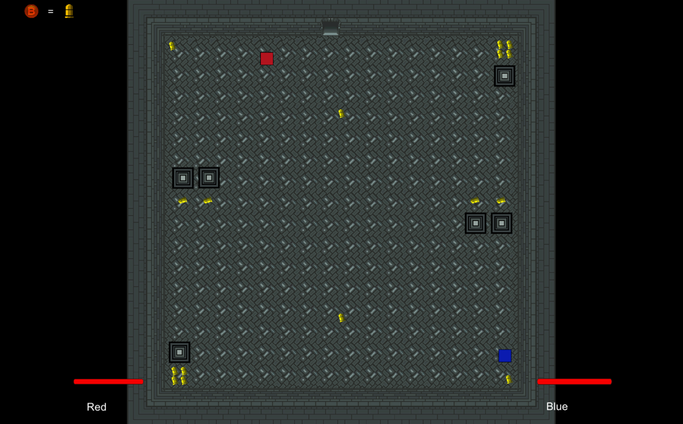
A new UI
The top left "tutorial" wasn't fitting to me, because after you've learned that you need to hold b to reload this is just annoying. So I removed that. The health bars made sense before because the idea was that players can type in their names. But now we have the Red/Blue-Theme so why not just make healthbars in the matching color and forget about names? Let's do that.
Image Effects
I'd love to say that I did all of the image effects myself but I didn't I've created an image effect for the scanlines. The bloom-effect and the vignette are taken from the unity standard assets
package. I've taken those to give it this old screen type of look.
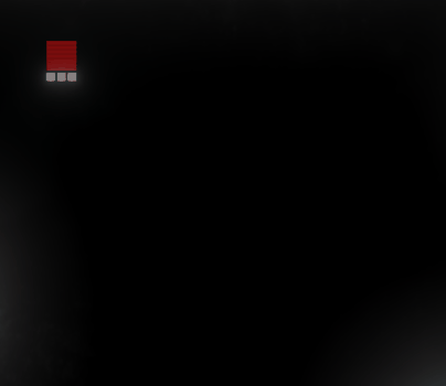
Particle Effects
To make things easier you can see gifs here of the 3 particle effects I've made. On the top left there's a simple shoot, to the right you'll see a hit effect and in the bottom there's a dash
effect. For all of those I've used a simple white square as a sprite.
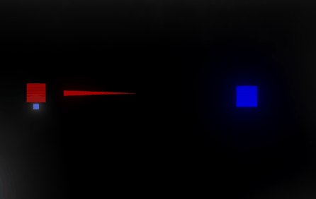
A little comparison: